Pink Floyd / The Wall : Does packaging make a difference?
The 2011 remastering campaign of Pink Floyd’s complete back catalogue has largely been judged a success, thanks to the audio skills of James Guthrie and Joel Plante who were responsible for all the remastering. If they sound great, how to they albums look? How do they feel? Has the same care and attention been bestowed on the packaging? Has this area really delivered to the same extent as the audio?
Putting to one side the big Immersion boxes, how does the 2011 edition of The Wall plucked from a Discovery box set compare to The Wall from the 2007 Oh, By The Way box set? Let’s take a look and find out…
Front Cover
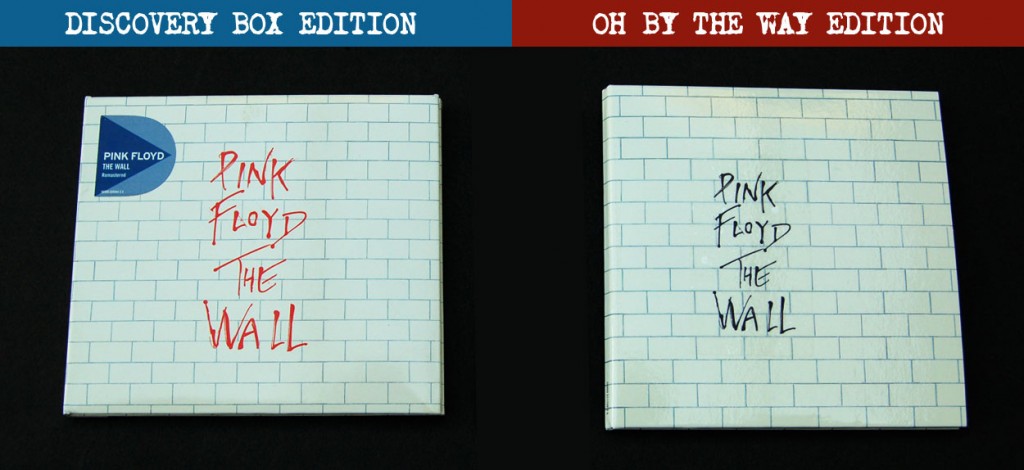
The new Discovery Edition has one really obvious difference, with the type in red instead of black. This works well on the dark background of an Immersion Box front cover, but looks pretty horrible on the normal white background. Too bright and garish. The Oh, By The Way edition is a ‘vinyl replica’ or mini-LP CD so the size of the type in relation to the front cover is exactly as per the original release. This tells us the the type on the new Discovery edition has been increased in size, which lacks subtlety and looks a little crass. The vinyl replica detail extends to having the type on a removable transparent sticker, allowing the user the option of the viewing the cover without type.
Crucially, the Discovery edition is a rectangle and not a square. 140 x 125mm to be precise. Modern digipak or card sleeve packaging only really works as a rectangle but unlike the recent McCartney or Beatles remasters the previously square artwork has not been preserved by a thin stripe on the left hand side. Achieving square artwork within a rectangle normally requires ‘zooming in’ by a small amount, effectively cropping artwork at the top and the bottom. The Oh, By The Way edition is a perfect square at 135mm on each side.
Score: Discovery: 0 – 1 Oh, By The Way
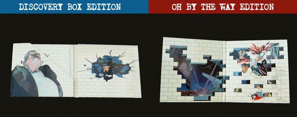
Inside Gatefold
The Oh, By The Way edition maintains the original inside gatefold with Gerald Scarfe illustrations and credits. The Discovery edition enlarges specific elements of the illustration and creates something new. The trouble with this is that it lacks the impact of the original and the enlarged artwork isn’t sharp and looks a bit grainy. Point to Oh, By The Way.
Score: Discovery: 0 – 2 Oh By The Way
Back Cover
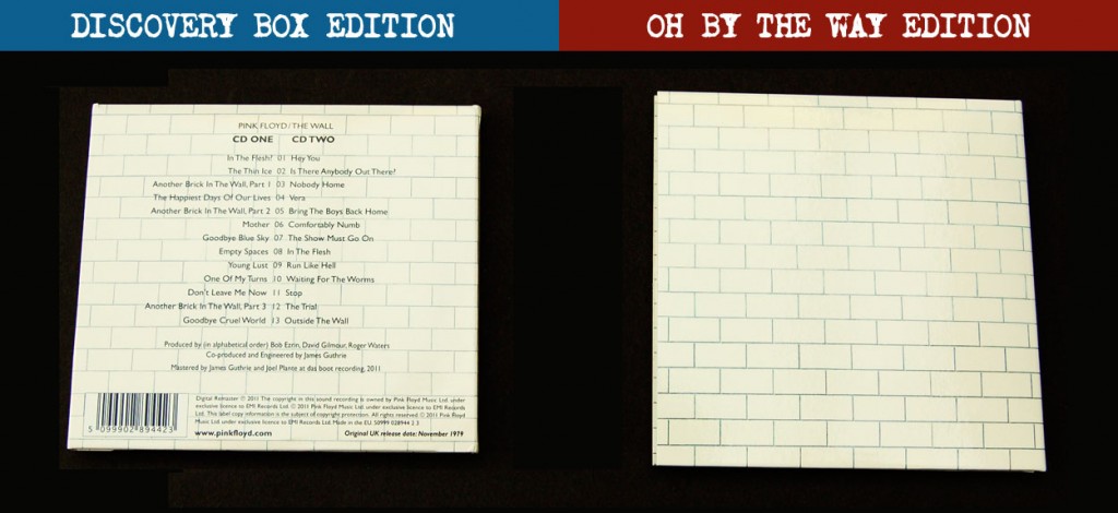 The stark empty white wall on the right looks great. Perfectly evokes the themes of the album. Discovery, because available separately, has to spoon feed the track listing to the potential purchaser in case he picks up in a record store while browsing. But why didn’t they use the Scarfe artworked titles rather than this dull boring type? Another point to Oh, By The Way.
Score: Discovery: 0 – 3 Oh By The Way
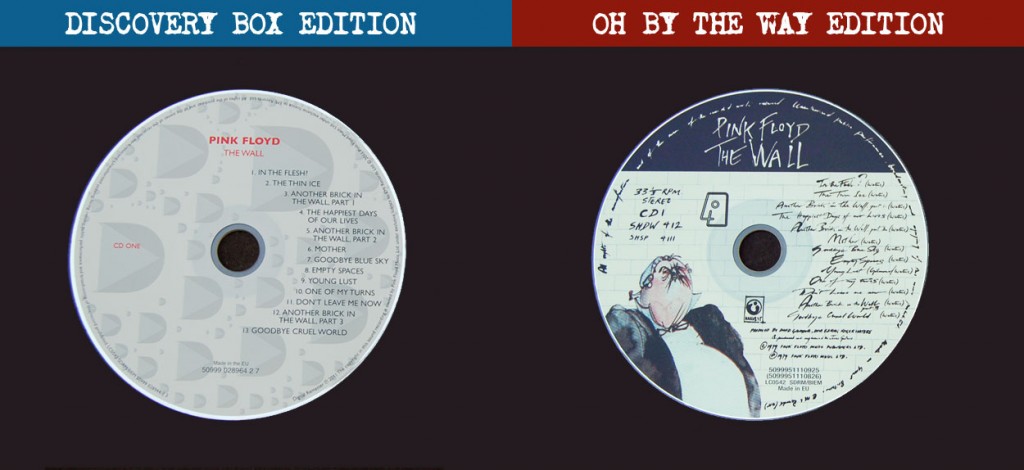
Discs
The Discovery edition discs have a rather insipid design, heavily utilising the newly design ‘D’ motif (for Discovery, of course). This pattern is actually consistent across the other albums but the colours vary. The Oh, By The Way discs are fully tailored to The Wall album – Scarfe artwork and lyrics and even the hand drawn Harvest logo. Another point to Oh, By The Way, with Discovery yet to score anything.
Score: Discovery: 0 – 4 Oh By The Way
General Packaging
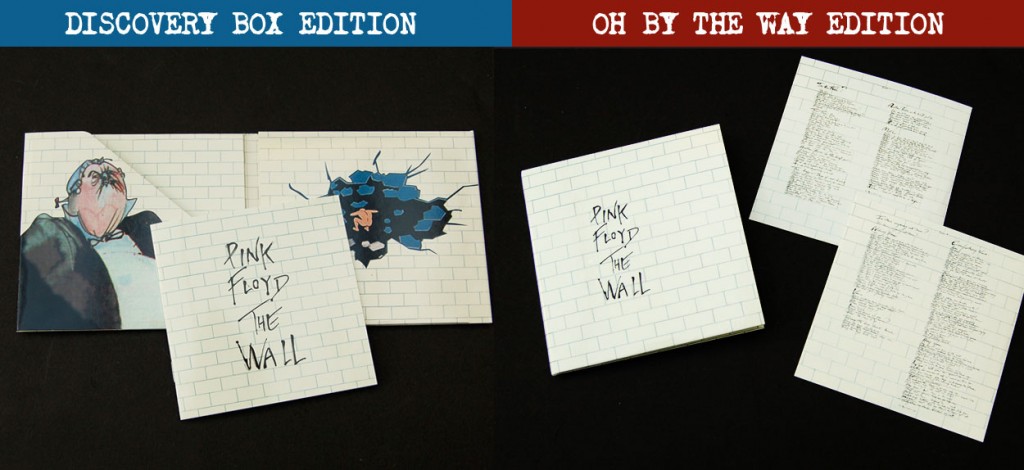 The Discovery edition actually folds out into a 6-panel card pack. The discs slot into the middle and right hand panels, while a booklet resides in the left hand panel. Some nice details such as the wall imagery extending inside the disc pockets. The discs aren’t really protected though, and can be easily scuffed as you push them in and out. Lovers of detail will enjoy the vinyl replica aspect of the Oh, By The Way edition which includes exact replicas of the original record sleeves. In addition there is a further rice-paper style sleeve for the disc which gives them good protection. Oh, By The Way lacks any booklet but is made from very thick card, much stronger than used in the Discovery set. A point each.
Score: Discovery: 1 – 5 Oh By The Way
Lyrics
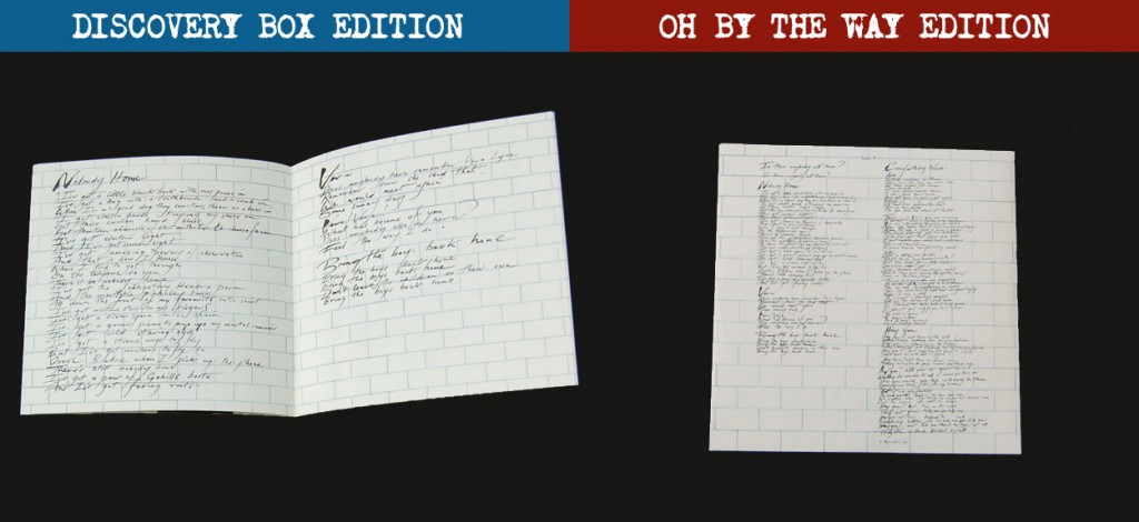 The lyrics for the Discovery Edition are reproduced in the 24-page booklet. All the original Gerald Scarfe artwork is used. Because the Oh, By The Way set is an exact replica of the vinyl, what was readable on a 12inch scale suddenly becomes eye-straining. Discovery nicks it here.
Score: Discovery: 2 – 5 Oh By The Way
Summary
The packaging of the individual albums in the Oh, By The Way editions are preferable to the new card-sleeve Discovery Editions. The Beatles stereo remasters seem to have been the inspiration behind the Floyd Discovery editions since the six panel approach with booklet is almost identical. Similarly, the Oh, By The Way box goes the vinyl-replica route in the same way as The Beatles exemplary Mono Box did back in 2009. Being Japanese-made The Beatles box took this to another level, but if you can forgive the inevitable compromise of shrinking some elements down (lyrics on inner sleeves for example) there is something very special about recreating the original packaging. Record labels will say they need barcodes and the like – more practicality and less artistry. Possibly, but did anyone really need to see a Quicktime logo on the back of the stereo Rubber Soul?
Although it is unrealistic to expect record labels to spend the kind of money required to go the full-hog Vinyl Replica route on most reissues, what should be par for the course is a respect for the original packaging decisions and the imagery used therein. A certain level of dumbing down is detectable these days – the enlarged logo on the Discovery edition of The Wall coupled with the track listing in boring sans serif typeface on the back is testament to that.
What are your thoughts on CD reissue packaging? Leave a comment to air your views.



By Paul Sinclair
7