Around the world in A Hard Days Night: blu-ray cover variations!
The world’s designers continue to wrestle with the problem of how the new 50th Anniversary blu-ray of The Beatles’ A Hard Day’s Night will look in their area of the world, so we thought we’d take a look at some of the different designs.
To recap, in America the always cool Criterion Collection have gone with this slightly Saul Bass-inspired design:

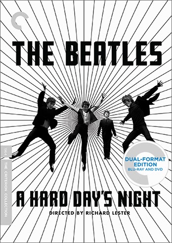
This is brilliant; loads of energy, it’s in black and white which is appropriate for the movie, and it’s nice and ‘arty’.
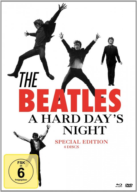
Here’s what the good old UK have gone for:
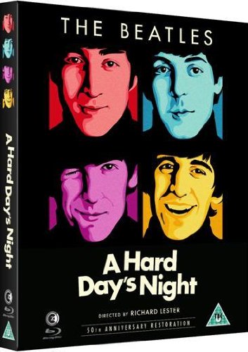
Oh dear. I’ve seen photofit mug shots more accurate than this hideous cover, with those awful colour tints. But hang on? Have studio Second Sight read the not too complimentary feedback left by SDE readers? It looks like they have, because now Amazon are showing a new cover image:
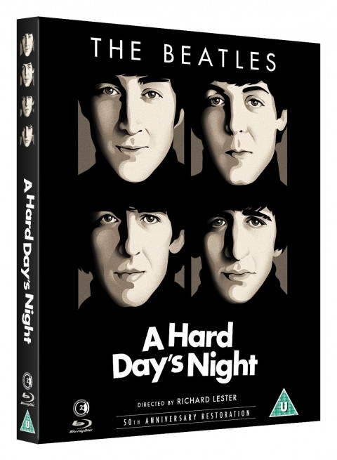
It’s the same head-shots, but at least Paul McCartney is no longer turquoise. And Ringo isn’t yellow. And John…well, you get the idea. Anyway, the Germans have decided to do their own thing too. Did you know the literal translation for “A Hard Day’s Night” in German is “A Hard Day’s Night”. It’s true. Ask Google Translate. Anyway this is what the German edition looks like:
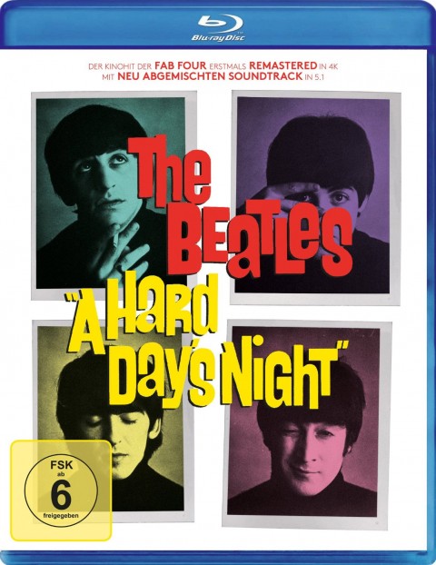
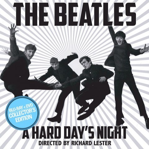
I recognise those colours! Well at least they’ve used the images from the album cover, so bonus points for that. But which grey-suited rule-maker in Deutschland insist that DVDs and Blu-rays have that stupid FSK design on the front, ruining front covers! I do prefer this to the UK design, although I might question the typography. I’d rather see a photo of Paul without “TLES” over his face. And they could have put Ringo at the bottom so he is looking up at one of his band mates. But wait! Germany have created a second cover design for their Blu-ray+3DVD ‘special edition’ version.
Okaaaay…. so they’ve nicked the black and white photos of the band from the US Criterion Version, but what’s Paul doing down there? Note to designers of German DVDs/Blu-rays: Remember there is a MASSIVE yellow box bottom left, so don’t put anything important – like, let’s say A BEATLE! – there. Paul is also about 40% of the size of John. First Yoko wouldn’t switch Lennon/McCartney for Macca and now this ignominy! The black and white Fab Four also seem to have a newspaper-style halftone effect applied, which is a bit random. Also that ‘the’ is rather horrible looking, and a bit introductory. “The” is part of the name, unlike say Pet Shop Boys or Eurythmics.
Finally here is the Australian version:
I know it’s square but I couldn’t find a hi-res image of the correct rectangular shape. Trust me when I say it just ‘carries on’ a bit further down with the line pattern. This is clearly inspired by the US version, but someone down under must have thought that even though it reads “The Beatles” and “A Hard Day’s Night” the Aussie blu-ray punter might want the reassurance of facial recognition before going ahead with their purchase, so the Fab Four are MUCH BIGGER on this cover. John also appears to be kicking Ringo in the balls. It’s all a bit uncomfortable looking and is an awkward tangle of legs and arms.
The US cover is the ‘winner’.
“A Hard Day’s Night” is out as a 50th Annversary Blu-ray in July.
 Reviews
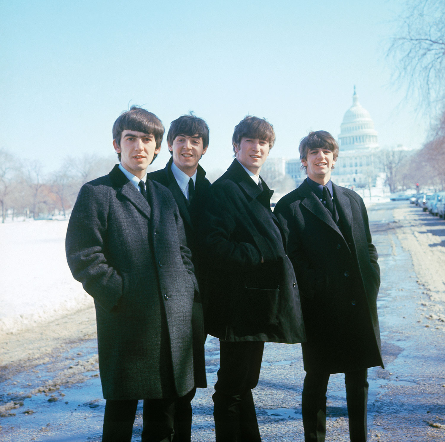
By Paul Sinclair
10