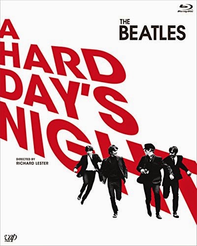
The world’s designers continue to wrestle with the problem of how the new 50th Anniversary blu-ray of The Beatles’ A Hard Day’s Night will look in their area of the world, so we thought we’d take a look at some of the different designs.
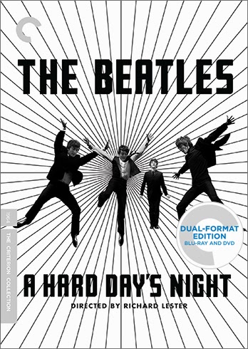
To recap, in America the always cool Criterion Collection have gone with this slightly Saul Bass-inspired design:


This is brilliant; loads of energy, it’s in black and white which is appropriate for the movie, and it’s nice and ‘arty’.
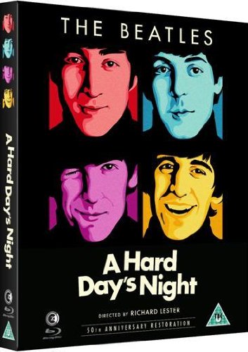
Here’s what the good old UK have gone for:

Oh dear. I’ve seen photofit mug shots more accurate than this hideous cover, with those awful colour tints. But hang on? Have studio Second Sight read the not too complimentary feedback left by SDE readers? It looks like they have, because now Amazon are showing a new cover image:
Continue reading “Around the world in A Hard Days Night: blu-ray cover variations!”

